At Niral AI, we’ve converted Figma designs to clean code for over 50 US projects, from Miami retail sites to Seattle SaaS dashboards. Figma’s real-time collaboration fits the fast pace of US agencies and startups, where tight deadlines and client demands drive workflows. This guide, built from our experience streamlining design-to-code handoffs, walks you through creating websites in Figma for American markets.
To design a website in Figma, set up frames for pages, create wireframes with shapes, add text and images, build interactive prototypes, and export to code using plugins like Anima or Builder.io for smooth developer handoff.
How to Design a Website in Figma Step by Step
Figma makes website design accessible, even for complex US projects. Start with a new file and set up frames for different devices. This approach keeps your workflow organized and ready for collaboration.
- Create a new file. Open Figma and select “New design file.” Choose a 1440px-wide desktop frame, common for US e-commerce or SaaS sites.
- Add device frames. Include mobile (375px) and tablet (768px) frames to plan responsive layouts early. This matches US mobile-first trends.
- Organize with pages. Use separate pages for wireframes, final designs, and prototypes. This helps US teams share files without confusion.
- Name layers clearly. Logical naming speeds up handoffs. We helped a Chicago agency save a week by structuring their files this way.
Building Wireframes in Figma
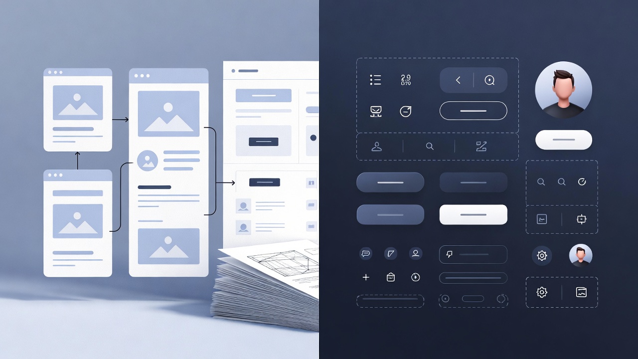
Wireframes lay the foundation for your site’s structure. They help you plan layouts before adding visuals. For US startups, this step ensures clarity for developers.
- Use basic shapes. Draw rectangles for headers or footers. Lines can separate sections like a features grid.
- Sketch key pages. For a US landing page, outline a hero section, content blocks, and a call-to-action.
- Enable grids. Turn on Figma’s 12-column grid to align with US frameworks like Bootstrap.
- Keep it simple. Use gray boxes for images and placeholder text. Focus on flow, not details.
Adding UI Elements and Styles
High-fidelity designs bring your wireframes to life. Add colors, fonts, and images that resonate with US audiences. Keep performance in mind for fast-loading sites.
- Import images. Drag in assets or use the Unsplash plugin for free stock photos, like cityscapes for US urban brands.
- Set a style guide. Define colors (e.g., blue for buttons) and fonts like Inter, ideal for clean US corporate sites.
- Add subtle effects. Use shadows or borders sparingly. Heavy effects slow down US mobile users, who drive 56% of traffic.
- Test on devices. Preview designs on mobile frames to ensure they look sharp for American users.
Creating Components for Reusability
Components make designs scalable and efficient. They’re especially useful for US agencies juggling multiple client projects. At Niral AI, we see components streamline code conversion.
- Build reusable elements. Turn buttons or cards into components. Create variants for hover or active states.
- Nest components. For example, a card might include an image, text, and button, reusable across pages.
- Publish to libraries. Share components with teams for consistency. This helped a San Francisco startup cut design time.
- Map to code. Well-structured components translate directly to code modules, reducing errors in Niral AI’s process.
Figma Website Design Tutorial for Beginners
Figma is beginner-friendly for US designers starting out. Its free tier and simple tools make it easy to learn. Focus on small projects to build confidence.
- Start with basics. Create a frame and add shapes or text. Try a portfolio page with a heading and bio.
- Use tutorials. Figma’s community offers free guides to learn frames and layouts.
- Practice mobile-first. Most US traffic is mobile. Design for small screens, then scale up.
- Experiment freely. Use the free tier to test ideas without risking client files.
Navigating the Interface
Figma’s interface is straightforward for new and experienced users. It’s designed for collaboration, which US remote teams rely on. Mastering it boosts efficiency.
- Learn the layout. Left sidebar shows layers. Right sidebar has properties. Top toolbar holds tools.
- Use shortcuts. Press V to select, R for rectangles. They speed up work for busy US freelancers.
- Track team edits. Avatars show who’s working where. This keeps agency projects in sync.
- Preview code. Niral AI’s platform mimics this setup, letting you see code without leaving design mode.
Incorporating Images and Media
Images and media enhance designs but need optimization. US sites prioritize fast load times and SEO. Proper handling ensures both.
- Upload assets. Drag images into frames. Crop with masks or round corners for modern looks.
- Add alt text. Include descriptions for SEO and accessibility, key for US search rankings.
- Optimize files. Use plugins like Image Tracer to reduce file sizes for faster US networks.
- Note media. Mark video placeholders in prototypes to guide developers on playback.
Best Practices for Designing Websites in Figma
Good practices ensure designs are functional and user-friendly. They align with US needs for mobile-first, accessible sites. Follow these to avoid common issues.
- Design mobile-first. Start with small screens. Mobile drives most US traffic.
- Use Auto Layout. It adjusts elements for different screen sizes automatically.
- Ensure readability. Keep text lines under 60 characters. Bold key points.
- Check accessibility. Use high-contrast colors to meet US compliance standards.
Optimizing for Collaboration
Collaboration is critical for US teams working remotely. Figma’s features make sharing and feedback easy. This cuts delays in fast-paced markets.
- Share links. Set edit or view access for clients and developers. Control permissions tightly.
- Pin comments. Attach feedback to specific elements for clarity during reviews.
- Use branches. Test design changes without altering the main file. Merge when ready.
- Integrate tools. Connect with Slack or Git for seamless US agency workflows.
Incorporating 2025 US Web Design Trends
Trends evolve fast in the US web scene. Staying current keeps designs competitive. Focus on engagement and accessibility for American users.
- Add micro-animations. Animate buttons or scrolls for better engagement.
- Support dark mode. It reduces eye strain, popular with US tech audiences.
- Prioritize minimalism. Light designs load faster, aligning with sustainable trends.
- Ensure inclusivity. High contrasts and alt text meet US accessibility needs.
Using Figma Prototypes for Website Design
Prototypes show how users interact with your site. They’re key for testing flows before coding. US clients value seeing the experience early.
- Link frames. Use arrows to connect pages, like product to checkout flows.
- Set interactions. Add taps or drags for actions like opening menus.
- Test on devices. Use Figma Mirror to preview on phones for realistic feedback.
- Show clients. A Miami retail client loved seeing their mobile store prototype.
Advanced Prototyping Techniques
Advanced prototypes mimic real site behavior. They help US teams validate designs before development. Niral AI uses these for accurate code output.
- Use variables. Switch states like light to dark mode for dynamic testing.
- Add logic. Set conditions, like showing a login screen after a tap.
- Embed in decks. Include prototypes in client presentations for clarity.
- Convert to code. Niral AI preserves animations and logic in exported code.
Figma to HTML Code Conversion Tips
Exporting designs to code is the final step. Clean files ensure smooth handoffs. Niral AI automates this for US developers.
- Inspect CSS. Get colors, spacing, and fonts from Figma’s inspect panel.
- Use plugins. Builder.io or Anima export HTML or React.
- Name layers. Clear names and groups prevent developer confusion.
- Export assets. Save SVGs for icons, PNGs for images, using relative sizes.
Common Pitfalls and Fixes
Mistakes in Figma can slow down coding. Avoiding them saves time for US projects. These fixes come from our experience.
- Clean layers. Disorganized layers confuse devs. Group and name everything.
- Test responsiveness. Resize frames to check layouts on all devices.
- Check accessibility. Use Figma’s contrast tools to meet US standards.
- Avoid overlaps. A Seattle client’s overlapping elements broke exports; we fixed it.
Figma Web Design Workflow in the US
A clear workflow keeps US projects on track. It balances speed and quality. Niral AI fits into this process seamlessly.
- Research first. Study competitors to gather ideas for your site.
- Wireframe and design. Move from layouts to high-fidelity visuals.
- Prototype and test. Validate flows with clients before coding.
- Handoff cleanly. Use Niral AI to generate code repos for developers.
People Also Ask
Can Figma be used to build a real website?
Figma creates designs and prototypes. Export to code with plugins or Niral AI for live sites. This helps US startups launch fast.
Is Figma good for beginners in web design?
Yes. Its free tier and tutorials are perfect for US freelancers. Start with a simple portfolio to learn the ropes.
How do I convert Figma designs to HTML?
Organize layers first. Use plugins like Anima or Builder.io. Niral AI automates clean, responsive HTML exports.
What are the best Figma plugins for web design?
Unsplash provides free images. Auto Layout ensures responsive grids. Builder.io and Locofy export code for US mobile sites.
Does Figma support responsive web design?
Yes. Auto Layout and device frames adapt designs to any screen. This suits US mobile-first trends.
Conclusion
Designing websites in Figma involves setting up frames, creating wireframes, adding UI, building prototypes, and exporting code. For US startups and agencies, mobile-first designs and clean handoffs are key. Niral AI simplifies the process by converting Figma files to production-ready code quickly.


