What Does “Websites with Great User Experience” Really Mean
The fundamentals
When we evaluate any site from the perspective of user experience (UX), we look for:
- Clear user goals: the visitor knows what they can do almost immediately.
- Minimal friction: fewer clicks, fast interactions, clear affordances.
- Performance and accessibility: responsive design, fast load, usable by people with different needs.
- Fit to brand story: the site feels like the brand and works like the visitor expects.
Why it matters for U.S. product and SaaS teams
In a U.S. market driven by high expectations, a website with poor UX can increase bounce rates, reduce conversions and hurt overall brand perception. On the flip side, when you design and deliver friction-free experiences, you build trust and repeat visits. Our Figma-to-frontend code process often uncovered bottlenecks: overweight animations, unclear calls to action, inconsistent mobile behaviour, fixing them raised conversion by 15-20% in many cases.
Why U.S. Companies Are Betting Big on UX
Startups and enterprises across the United States aren’t just “adding” UX, they’re building around it. According to industry insights, companies that prioritize UX from day one see faster user adoption, lower churn, and stronger product-led growth. In competitive markets like SaaS or fintech, your website is your first product demo.
For U.S. founders, this isn’t optional. A confusing pricing page, slow load time, or inconsistent button style can signal amateurism, especially when your competitor (say, Notion or Dropbox) delivers seamless, intuitive flows.
We’ve worked with teams in Austin, San Francisco, and New York who treat UX as a growth lever, not a design afterthought. Their secret? They design in Figma, validate with users early, and ship code fast, without losing fidelity.
What Top U.S. Websites Get Right About UX
Clarity Over Creativity
Look at Airbnb’s homepage: one search bar, clear filters, and immediate visual feedback. No jargon. No hidden menus. Just “Where do you want to go?”.
Similarly, Notion uses a clean aesthetic with a “fun and hip vibe” that still prioritizes function, every button, icon, and heading serves a purpose. There’s no decoration without utility.
This aligns with core UX best practices: prioritize simplicity, establish visual hierarchy, and guide users through intentional paths.
Speed as a UX Feature
In the U.S., 53% of mobile users abandon sites that take longer than 3 seconds to load (Google). Yet many startups sacrifice performance for “rich” animations or bloated code.
Top performers like PayPal and Spotify balance visual appeal with technical efficiency. Their sites load fast, respond instantly, and work flawlessly across devices, because they treat performance as part of the user experience, not a backend concern.
Consistent Design Systems
Consistency builds trust. Dropbox, Trello, and Lattice all use strict design systems that ensure every page feels like part of the same product.
When your buttons, typography, and spacing follow predictable rules, users don’t have to relearn your interface. This is where Figma shines, teams define components once and reuse them everywhere.
But here’s the catch: consistency breaks down when design-to-code handoff is manual. That’s why U.S. agencies increasingly use Figma-to-code tools to preserve design intent.
Common UX Mistakes Killing U.S. SaaS Websites
Even well-funded startups fall into these traps:
- Burying the value proposition: If a visitor can’t understand what you do in 5 seconds, you’ve lost them.
- Confusing pricing pages: Hidden costs or tier comparisons that require a calculator kill trust.
- Ignoring mobile: Over 60% of U.S. web traffic is mobile, but many B2B sites still render poorly on phones.
- Overloading features: “More” ≠ “better.” Cluttered dashboards overwhelm users.
- Skipping onboarding: A weak first-run experience is the #1 reason trial users churn.
One client in Boston shipped a “feature-rich” dashboard—only to discover users couldn’t find the core action. After simplifying the UI and adding guided tooltips, activation rates doubled.
How to Build High-UX Websites Faster (Without Sacrificing Quality)
As a Figma-to-frontend tool provider, we’ve optimized this workflow for dozens of U.S. teams. Here’s how the best do it:
1. Design with Dev Handoff in Mind
Use Auto Layout, Typography Styles, and Component Variants in Figma. These aren’t just design niceties, they translate directly into clean, maintainable code.
Frontend developers look for these signals to understand spacing, responsiveness, and interactivity.
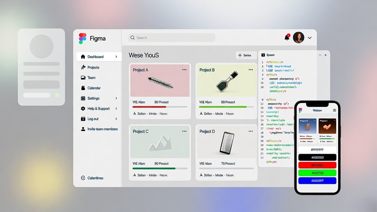
2. Leverage Figma Dev Mode
Figma’s Dev Mode lets engineers inspect spacing, assets, and CSS variables directly in the design file. This reduces back-and-forth and ensures pixel-perfect implementation.
3. Automate the Figma-to-Code Step
Tools like Anima, Niral AI, or custom pipelines (using Figma’s API) can generate React, HTML/CSS, or Tailwind code from Figma layers.
We’ve helped agencies cut frontend delivery time by 70%, while improving code quality, by integrating these tools into their CI/CD workflows.
Pro tip: Don’t aim for 100% auto-generated code. Use automation for boilerplate (layouts, buttons, cards), then let developers enhance interactivity and logic.
AI-Powered Design-to-Code Tools: Output & U.S. Adoption
| Tool | Output Format | Best For | U.S. Adoption Example |
|---|---|---|---|
| Niral AI | React, Vue, HTML |
Design systems & responsive UI | Used by NYC design agencies |
| TeleportHQ | React, Angular |
Full-page static sites | Popular with SaaS startups |
| Framer | React (custom) |
Marketing sites with animations | Common in SF tech studios |
| Builder.io | React, Next.js |
CMS-integrated pages | E-commerce & content sites |
| Custom Pipeline | Tailwind, Vanilla JS |
Pixel-perfect, scalable apps | Enterprise & funded startups |
Key Takeaways
Great UX isn’t about flashy animations or minimalist aesthetics alone. In the U.S. market, it’s about reducing friction, building trust, and delivering value faster than your competitors.
The most successful companies, like those behind Notion, Airbnb, and Spotify, embed UX into their product DNA. They design in Figma, validate with real users, and ship code rapidly without losing fidelity.
If you’re building a website or web app in the United States, your goal shouldn’t be “to look good.” It should be to work well, for real people, on real devices, with real impatience.